Why Your Jewelry Box and Paper Bag Don't Match

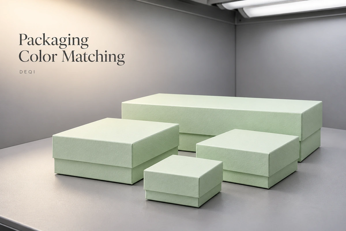
A jewelry box and its matching paper bag can look close in one room and noticeably different in another. That does not always mean a printing error: the paper base, surface finish, colorants and lighting can all affect what you see. Reducing unwanted variation starts with agreeing on the materials, a physical reference and the conditions used to approve color.
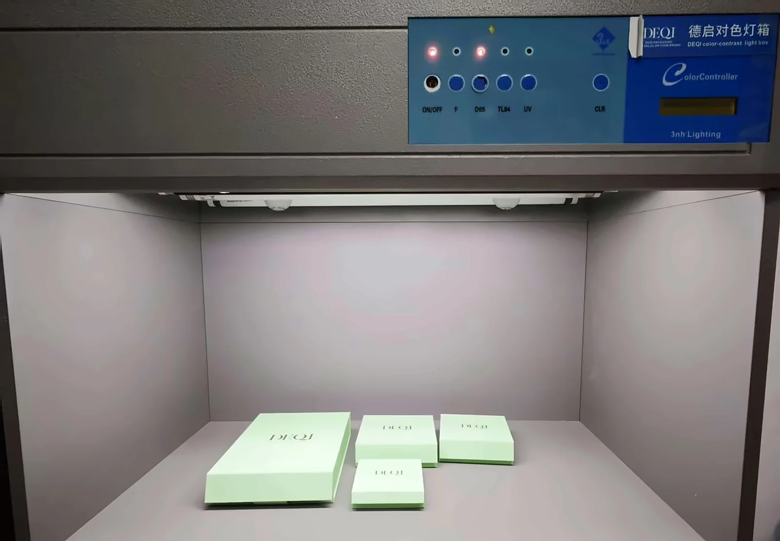
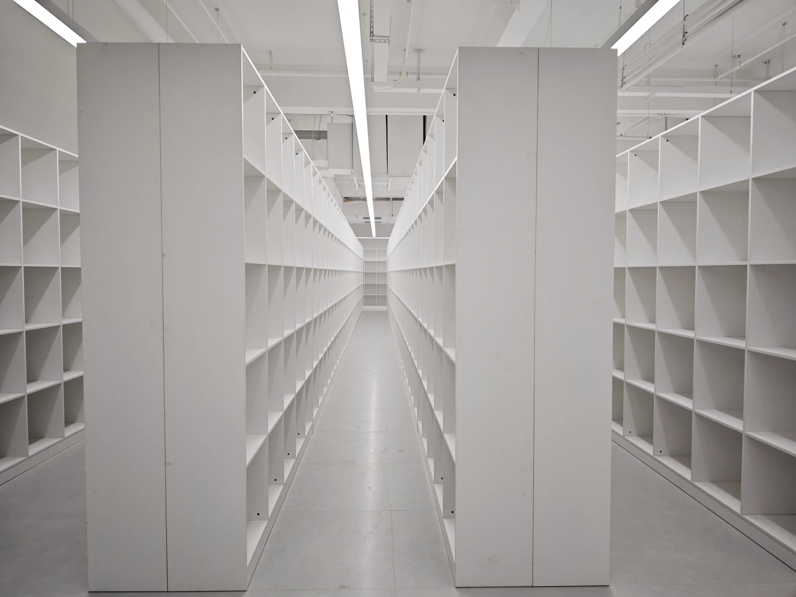
At DEQI, we compare matched packaging under a D65 daylight-simulating light source. We also number and organize customer samples in a dedicated sample archive, giving repeat orders a physical reference for the details of earlier work.
Why a Box and Bag Can Look Different
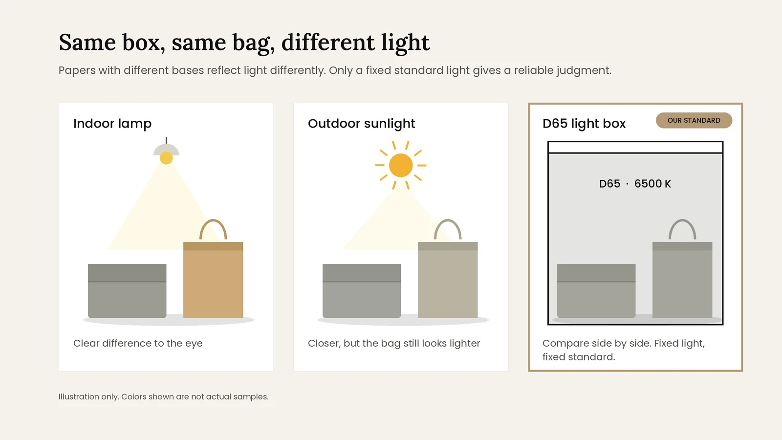
On one project, a gift box was wrapped in linen-gray paper while the matching bag used kraft paper. The two items were intended to share the same color. Under indoor lamps, the difference was clear. Outdoors, the overall tone looked closer, but the bag still appeared lighter.
Different paper bases, textures and coatings affect how light is reflected and how printed color appears. A color reference that works on one material may need adjustment on another. If two samples match under one light but not another, the effect is known as metamerism. The practical point is that a match in one setting does not guarantee a match everywhere.
Our Primary Reference: D65 Standard Light
Window light changes with the time of day and weather, while workshop lamps can introduce another set of conditions. These uncontrolled settings do not give everyone a consistent basis for approval.
We assess matched packaging side by side in a color viewing booth under a D65 daylight-simulating light source. CIE standard illuminant D65 represents average daylight with a correlated color temperature of approximately 6500 K. The booth provides a controlled reference for comparison; it does not remove differences between materials.
- Place the items that need to match together in the viewing booth.
- Compare their appearance under the D65 light source and review any visible difference before approval.
- For difficult combinations, such as kraft paper paired with another paper, review the match at sampling and again before mass production.
If packaging needs to look coordinated under a particular store light, raise that requirement before sampling. Agree whether an additional viewing condition is needed alongside the primary approval light.
Approve the Actual Material and Finish
A Pantone reference or an existing packaging sample helps communicate the target, but it does not guarantee identical results on every surface. For printed work, discuss the color reference and printing method. For colored paper, fabric or ribbon, review a sample of the actual material.
Kraft paper needs particular attention because its base color and surface affect the result. A shade approved on white paper may look different on kraft. Gloss, matte and other surface treatments can also change the appearance, so evaluate the planned finish as part of approval.
| Before approval | What to confirm |
|---|---|
| Color reference | The physical sample or color standard that takes priority if references disagree |
| Materials | The intended paper, fabric or other material for each item |
| Final appearance | The planned print, coating, lamination and other visible finishes |
| Viewing conditions | The primary approval light and any additional retail-lighting requirement |
| Acceptable variation | What is acceptable across materials and between repeat orders |
Use screen images to discuss designs, rather than as the sole basis for final color approval. Monitor settings, camera exposure and white balance can change how a sample looks. A structural mock-up or an unfinished printed sheet may also be unsuitable as the final color reference; clarify what each sample is intended to approve.
Review the Whole Packaging Set Together
A box, bag, card and pouch may each look acceptable separately but feel inconsistent when placed together. Ask to review the items as a set, including their final finishes, and identify which color relationships matter most to your brand.
Coordinating material purchasing and production schedules can help reduce avoidable variation. Where the same material is used across items, discuss whether it can be sourced from one batch. Different materials still need their own assessment: one production schedule cannot guarantee an identical appearance across paper, fabric and ribbon.
How DEQI Keeps a Reference for Repeat Orders
We number and organize customer samples in a dedicated sample archive. For repeat orders, these retained samples provide a physical reference for reviewing the previous work's color, materials, finish and construction details.
This gives our team a concrete reference beyond photographs or written descriptions and helps maintain consistency from one order to the next. It supports the review of earlier details rather than a promise that every material will remain visually identical across all batches and lighting conditions.
When placing a reorder, identify the previous project and explain whether the new packaging will be displayed alongside remaining stock. If you want to change the paper, finish or another visible detail, flag that before production so the need for a new approval sample can be discussed.
A Practical Checklist Before Production
- Identify the items that must match. List the box, bag, card, pouch or other components and review them together.
- Provide a clear reference. Share a physical sample where possible, plus the complete color code if one is used.
- Approve the intended materials and finishes. Do not assume a screen image or a sample on different paper represents the final result.
- Agree on the approval conditions. Discuss the reference light, any retail-lighting requirement and the acceptable degree of variation.
- Record what was approved. Keep the sample reference, material and finish specifications, and approval date together. Store your reference sample away from sunlight and contamination.
- Review changes before production. A change in material, supplier, printing process or finish may require a new color sample.
Frequently Asked Questions
Does the same Pantone reference guarantee a match?
No. It communicates a target, but different materials, printing methods and finishes can produce different appearances. Agree on a suitable physical reference and review the intended materials before production.
Will packaging approved under D65 match under every light?
Not necessarily. D65 provides a consistent daylight reference. If appearance under a specific store light is important, discuss that condition before sampling and agree whether an additional comparison is needed.
Can different materials look exactly the same?
They may be closely coordinated, but identical appearance under every light cannot be assumed. Agree on the material combination, reference sample and acceptable variation before production.
How do you support consistency on repeat orders?
DEQI numbers and organizes customer samples for future reference. These retained samples help our team review the color, materials, finishes and construction details of earlier work when assessing a repeat order.
Let's Talk About Your Packaging Needs
Have a question or a project in mind? Share your requirements with our team, and we'll help you explore suitable packaging options.
Send an Inquiry →