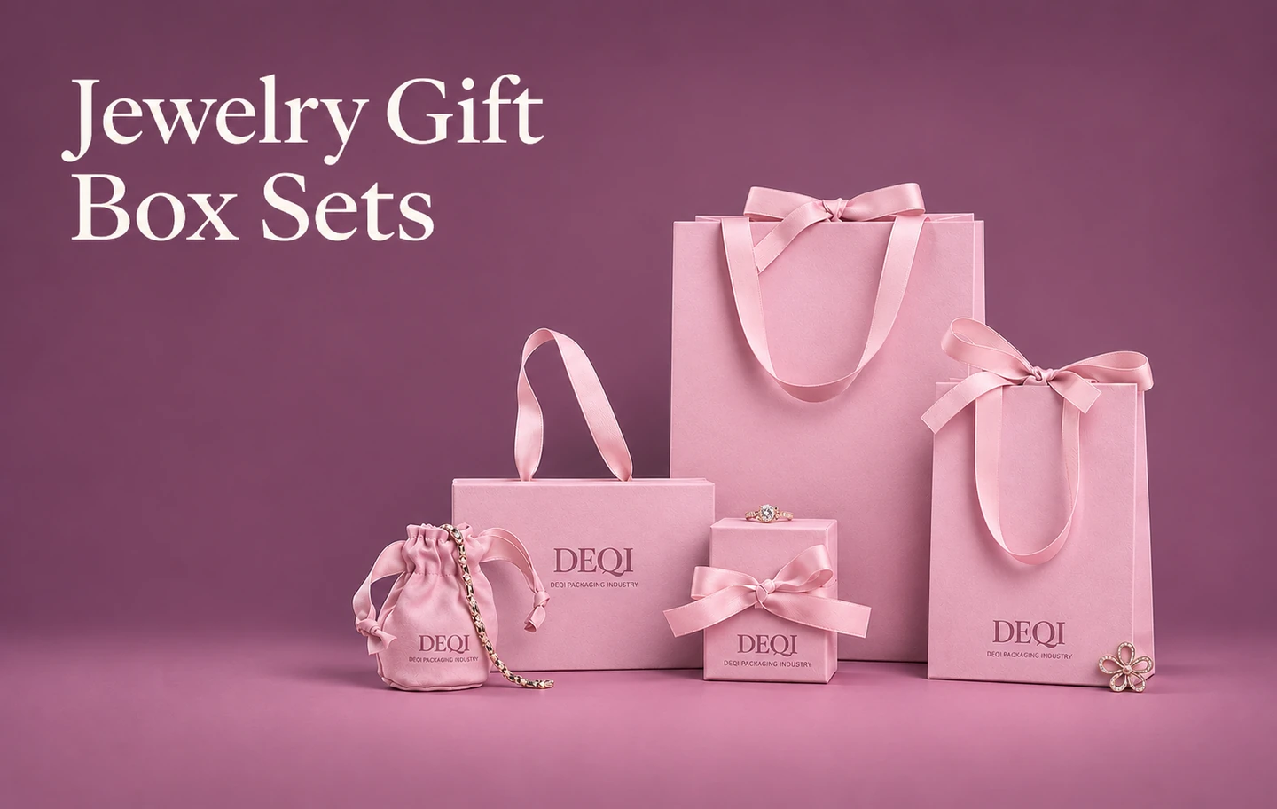
Case Study: Double-Door Jewelry Gift Packaging
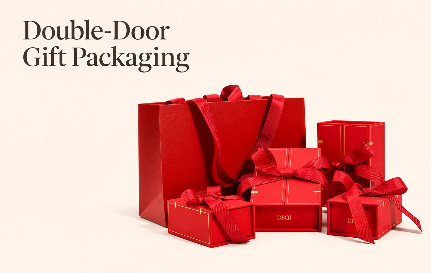
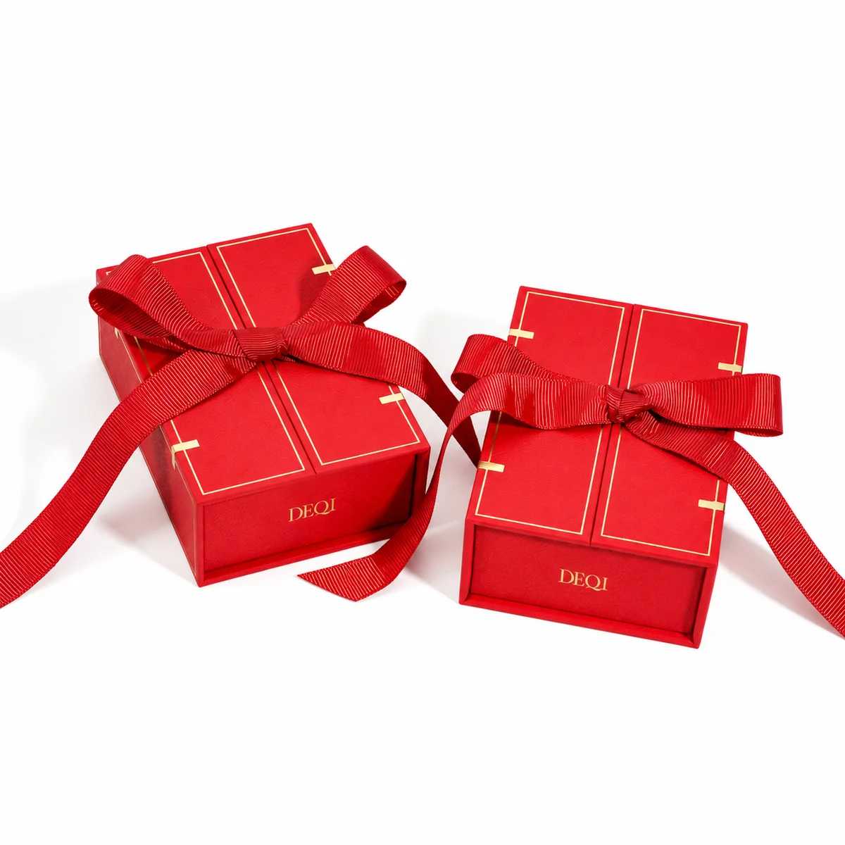
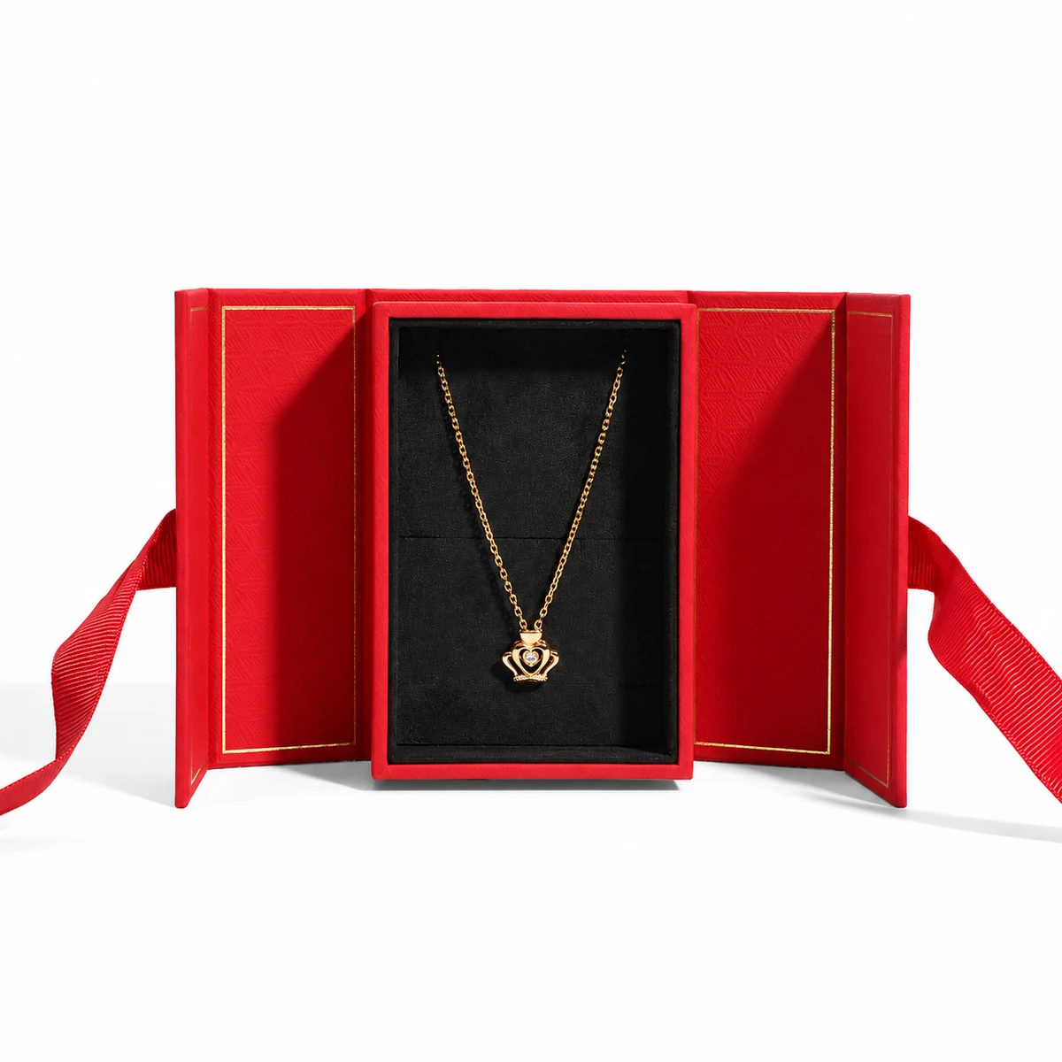
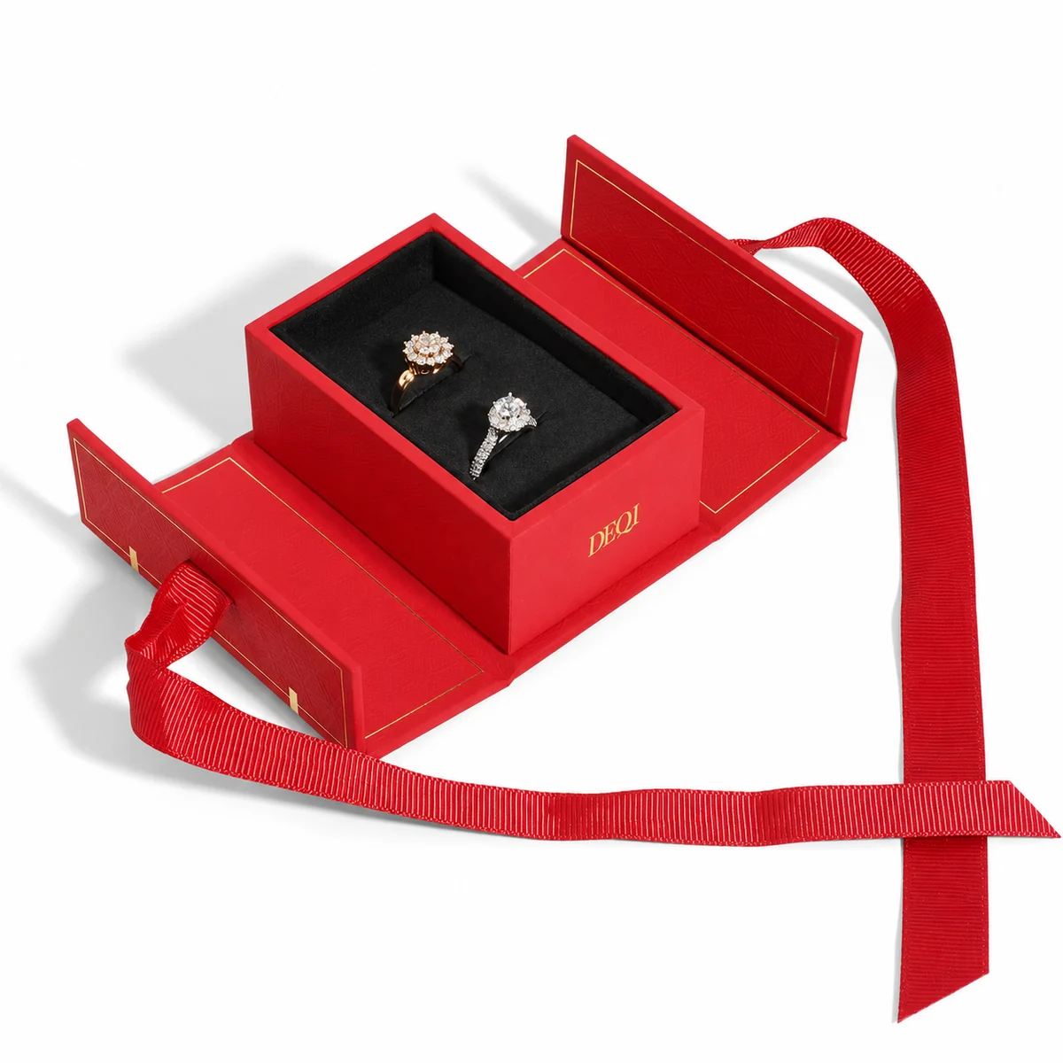
This jewelry gift packaging collection was developed around more than its closed appearance. For a Chinese fashion jewelry retail brand, the double-door gift box makes the opening process part of the design: untie the ribbon, unfold the two doors and reveal the jewelry in its fitted insert.
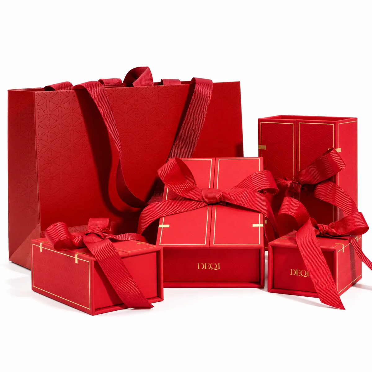
The coordinated red boxes and matching paper bag bring together a patterned surface, gold-colored border details and grosgrain ribbons. The overall design considers both the presentation of a gift and the experience of the person opening it.
Client and Project Overview
| Client profile | A Chinese fashion jewelry brand with a chain retail presence |
| Brand context | Contemporary jewelry with an emphasis on Eastern aesthetics and design |
| Retail channels | Physical retail stores, franchise channels and online retail |
| Packaging scope | Double-door jewelry gift boxes, coordinated paper bags, ribbons and jewelry-specific inserts |
| Design focus | A considered opening experience and a coordinated presentation across the set |
Designing the Opening Experience
The double-door structure gives the user a sequence of interactions rather than simply lifting off a lid. With the doors closed, the ribbon bow and paired panels form the first impression. Once the ribbon is untied, the panels open outward to frame the jewelry inside.
This opening sequence was an important consideration in the overall packaging design. The aim was to make the transition from receiving the gift to viewing the jewelry feel deliberate, while keeping the interaction understandable.
From Closed Gift Box to Jewelry Display
| Design element | Role in the experience |
|---|---|
| Ribbon bow | Introduces the gift presentation and the first step of opening |
| Two opening doors | Unfold outward to reveal and frame the central jewelry insert |
| Dark interior | Creates a visual contrast with the red exterior and displayed jewelry |
| Jewelry-specific insert | Positions each jewelry type within the presentation |
| Matching paper bag | Extends the coordinated appearance to the retail handover |
One Visual Language Across Different Pieces
Red surfaces, fine gold-colored lines and textured ribbon create a shared visual language across the boxes and bag. The patterned finish adds detail without requiring a different decorative approach for every box size.
The supplied product images also show necklace, ring and bangle presentations. Different inserts adapt the interior to the jewelry, while the outer design remains part of the same collection. The case is therefore about both a coordinated set and the individual experience of opening each piece.
How DEQI Supports Consistency
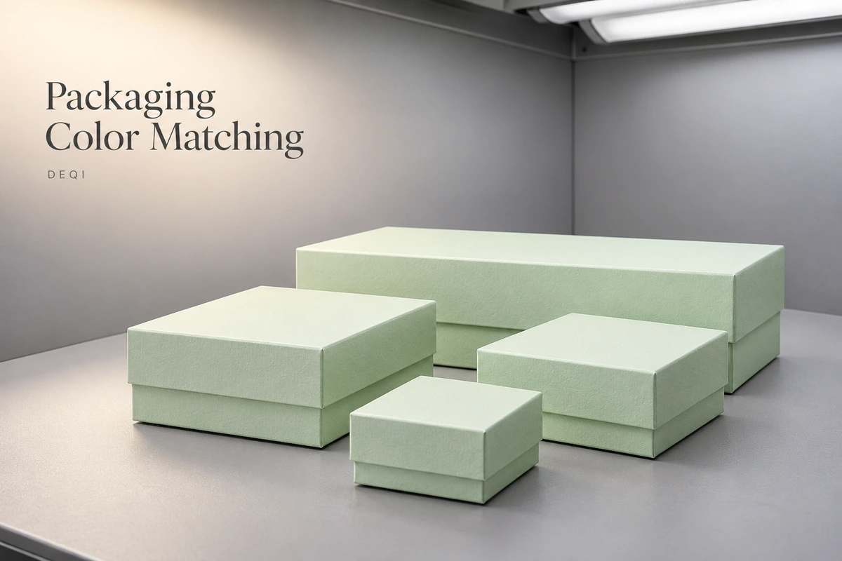
For coordinated brand packaging sets, DEQI compares matched items under a D65 daylight-simulating light source. Corresponding materials are purchased from the same batch across the relevant components, and complete sets are arranged for production in the same workshop during the same period.
We also number and retain customer samples to provide a physical reference for later orders. These general working practices support the review of color, surface appearance and construction details; different materials are not assumed to look identical under every light source.
Project Summary
This jewelry gift packaging case illustrates how the structure and the visual design can work together. The double-door opening, ribbon interaction, fitted interior and matching bag make the experience a connected part of the packaging set, rather than treating the box exterior as the whole design.
Let's Talk About Your Packaging Needs
Have a question or a project in mind? Share your requirements with our team, and we'll help you explore suitable packaging options.
Send an Inquiry →
Gold Jewelry Gift Box System for a Heritage Brand